PROJECT OVERVIEW
Toys Et Cetera is a Chicago-based Mom 'n Pop toy shop founded in 1976. They prioritize educational toys over popular brands, and strong customer service and community building over business dominance.
TIME FRAME: 2 Weeks
TOOLS: OmniGraffle, Google Suite, Markers, Post-Its
DELIVERABLES: Clickable medium-fidelity wireframe prototype. Located here
THE PROBLEM
While Toys Et Cetera provides great customer service and makes strong efforts to form relationships with the community, its online store is severely lacking in providing the support users need to discover, choose, and purchase the products they desire with ease and efficiency.
Like the physical store, the digital layout and navigation is clunky, awkward, and doesn't facilitate discovery or enjoyment for the user.
GOALS
- Find underlying problems and motivations of the users to fully mitigate pain points
- Balancing needs of Toys Et Cetera with users
- Promote what makes their store unique
RESEARCH
Research consisted of four main phases:
- Brand Analysis
- In-Store Research
- Competitive Analysis
- Personas
BRAND ANALYSIS
Beginning research it was important to first get familiarized with Toys Et Cetera's current website as well as the branding that was being messaged.
Navigation: Cluttered, disorienting
Information: Excessive, Lack of hierarchy
Visuals: Dated (à la GeoCities), Overwhelming
IN-STORE RESEARCH
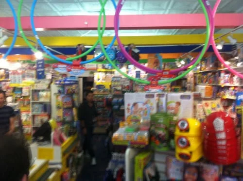
This is the image of the store coming in:
Immediately I could see that the store's layout resembled that of the website--cluttered, disorienting, and visually busy.
This aspect of the store was transferred into the website, but apparently not the strong customer service.
I decided I needed to learn more about the customers who frequent the store by doing contextual inquiry. It was apparent that customers had some trouble navigating.
But, what was also noticeable was that the store provided an approachable environment, with customers enjoying the act of browsing and discovering products. These aspects of the in-person store needed to be channeled into the website.
COMPETITIVE ANALYSIS
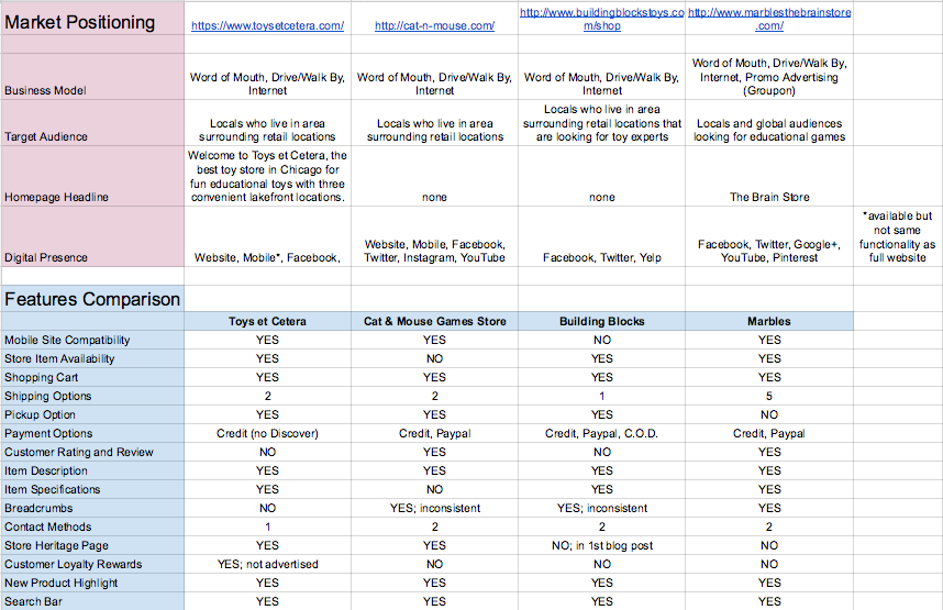
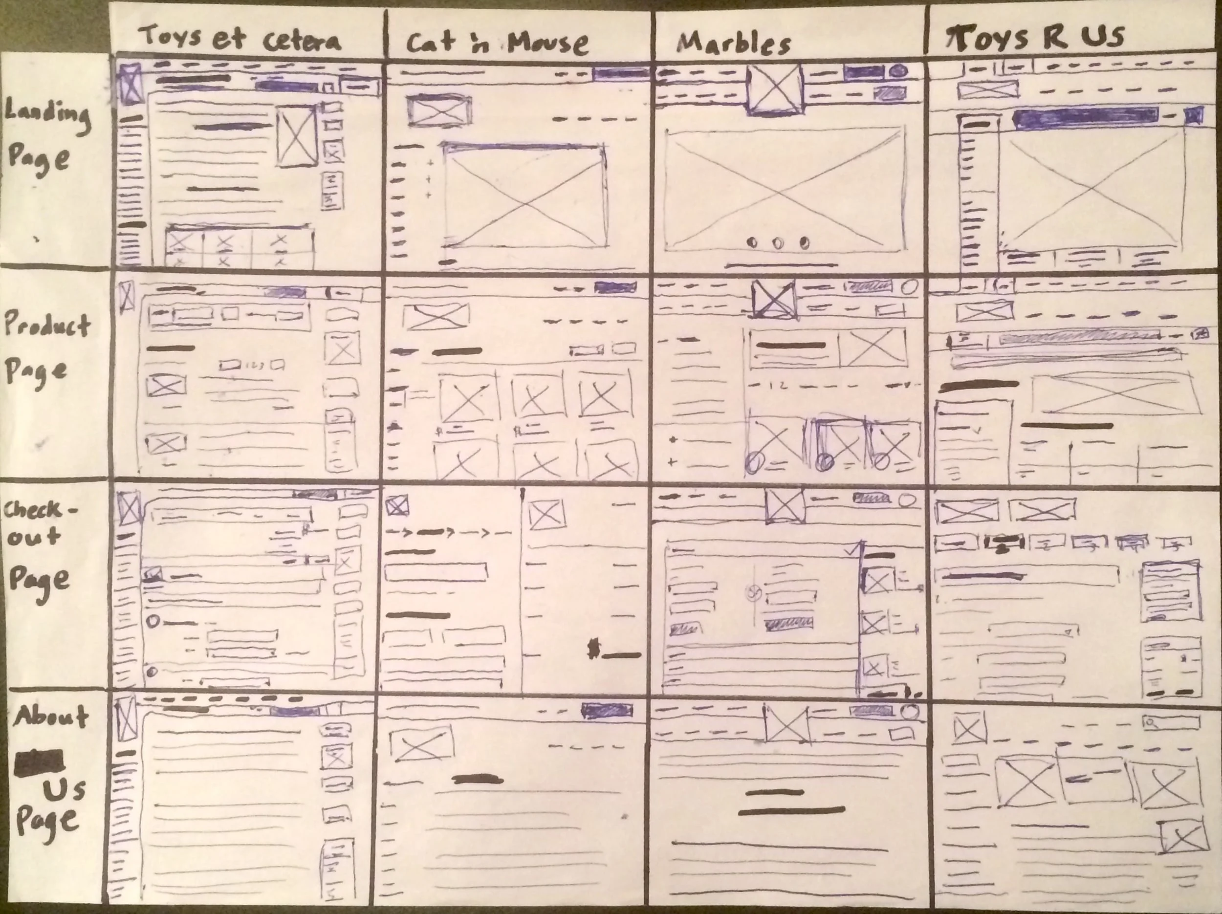
Through comparing existing toy store websites I was able to pinpoint some elements that facilitated a productive shopping experience, such as ease of use, flow, and efficiency when checking-out.
Using features, market and layout comparisons, I analyzed many large and small E-Commerce stores alike--from Reebok to American Girl--to see how they each conveyed their values, what components help enable an enjoyable shopping experience, as well as market positioning.
PERSONAS
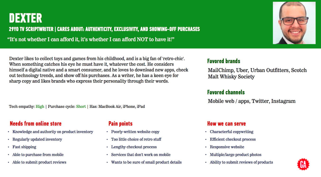
Personas were created to personify amalgamated data. When diagnosing problem statements and distilling design directions, the personas acted as an anchor to keep my design focus grounded in the realm of solving for the persona's pain points.
(click to see all 3 personas)
SYNTHESIS & ANALYSIS
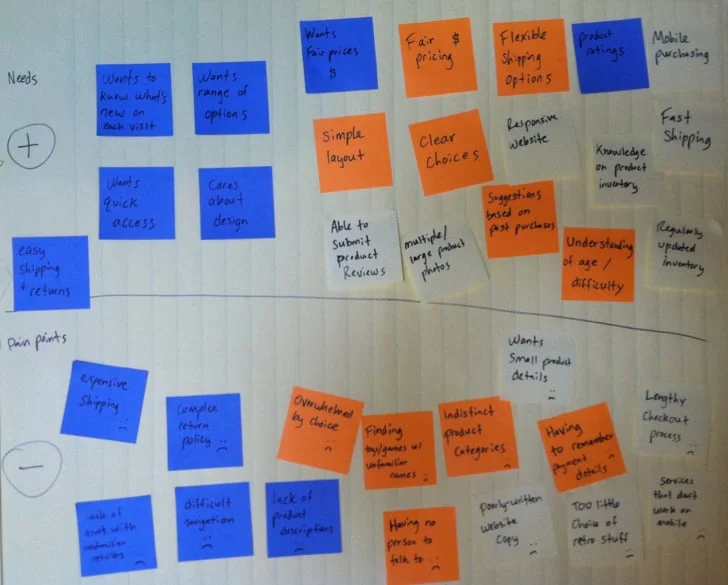
Writing each data point gathered from my research, I made affinity maps in order to find patterns.
I first organized the data by needs and pain points to find common trends and start to locate underlying issues. I later grouped by themes and finally distilled insights.
INSIGHTS
Through more rounds of synthesis and analysis, I discovered that for users to complete successful shopping experiences, they need assistance with respect to:
- architecture
- tools
- communication
Further synthesis led me to my problem statements and design directions:
IDEATION
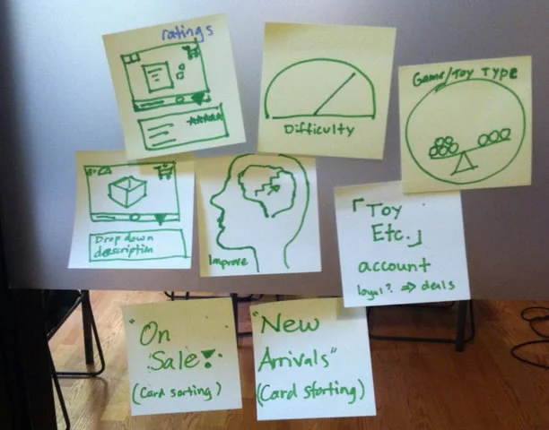
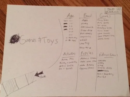
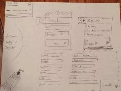
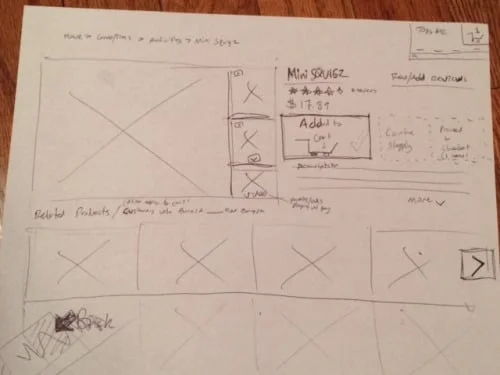
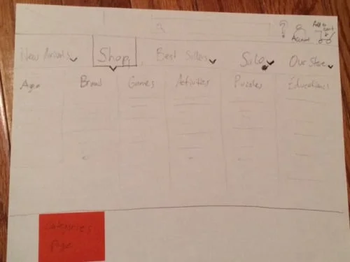
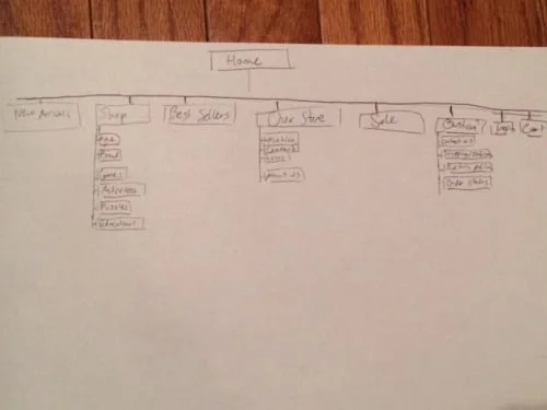
After crystallizing the design direction, I started sketching potential approaches to alleviate users pain points. Further ideation yielded more concrete components, visuals, and interactive elements.
WIREFRAMES
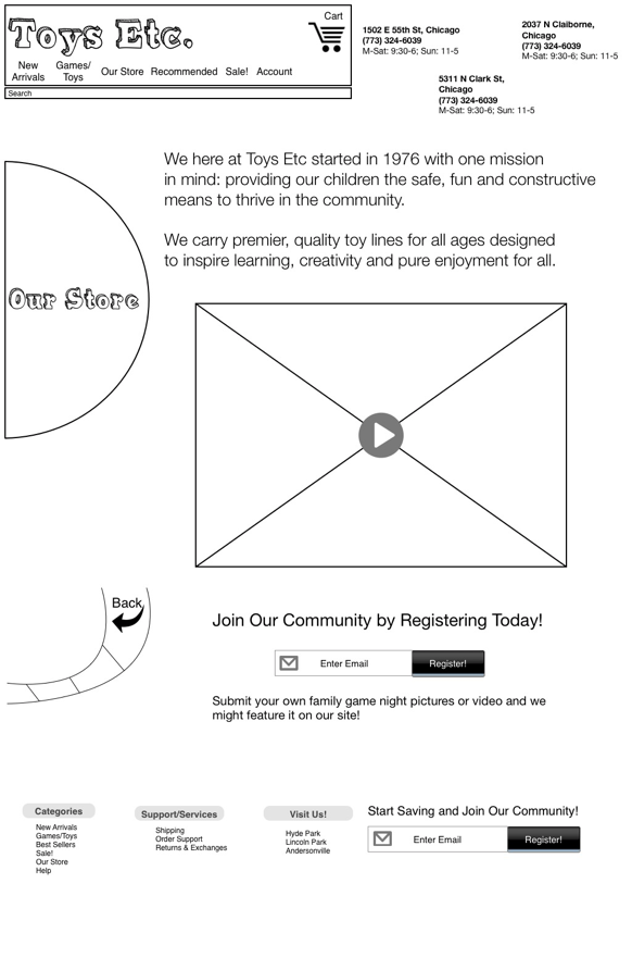
The next step in the prototyping process was to raise the fidelity and clarity of my sketches and put them into OmniGraffle.
USABILITY TESTING
I gained a lot of valuable insights just watching participants interacting with my prototype and hearing their comments.
FINDINGS:
- depending on the context, some participants prefer shopping more efficiently, others like to browse and take their time
- navigation should accommodate quick as well as leisurely shoppers
FINAL PROTOTYPE
Letting my the research guide and inspire me, I created an atypical landing page. Remembering back to seeing customers in the Toys Et Cetera store enjoying the act of browsing and exploring, I aimed to channel that feeling of in-store personability and warmth onto the landing page.
I added a game board and familiar game icons to convey a sense of nostalgia and playfulness to the user. The homepage is fun, but it's also clean and easy to use.
I knew the "About Us" page needed to be effective in communicating the stores values. With concise and meaningful copy, as well as a short video showing Toys Et Cetera's ethos, the stores values would be effectively messaged.
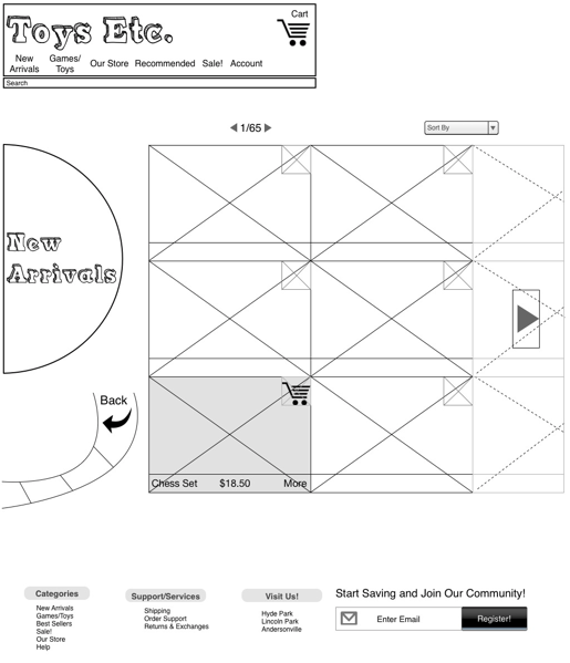
New arrival toys are displayed in a simple and organized way, with easy browse functionality.
CLICKABLE PROTOTYPE
To experience the full clickable prototype, click here


