PROJECT OVERVIEW
The Chicago Symphony Orchestra (CSO) has been a bastion for musical excellence and world-class musicianship since its founding in 1891.
The quality of the CSO's music and performances have remained unchanged. However, what has changed is CSO's apparent lack of a social and cultural foothold in enticing Millennials (18 to 35 year olds), whose share in attendees is far too low.
This growing disparity is becoming a bigger issue as Millennials outnumber the Baby Boomer generation. The CSO needs to find a way to stay relevant and entice Millennials to attend the symphony.
TEAM: Corbin Bartell, Brienne Moore, John Taboada
TIME FRAME: 2 Weeks
TOOLS: Sketch 3, OmniGraffle, Google Suite, Adobe Suite, Markers, Post-Its
DELIVERABLES: High-fidelity clickable prototype. Located here
MY ROLE: UX Designer, Lead Strategist
SOLUTION SUMMARY
Though the current CSO website does provide a sense of history, cultural value and information, our research indicated that the CSO as in institution doesn't appeal to or allow for an integration of Millennial customs.
The UX process led us to our ultimate goal of attracting Millennials. This was achieved through two main enticement-driven approaches:
- Increasing Social Media
- Creation of a Sister Site, WeAre.CSO.Org
FOCUS METHODS
Imagery: Inclusive & Personable
Tone: Cool & Classy
Content: Informative & Fun
DESIGN PROCESS OVERVIEW
DISCOVERY
BRAND AUDIT
Kicking off our research, we examined CSO's existing website. Merely looking at it provided our team with a trove information regarding what it's brand is and how it's being messaged.
Although the website provided plentiful information and gave off a sense of both rich history and culture, it failed to connect with Millennials because of these key areas:
Imagery: antiquated & homogeneous
Tone: exclusive & stuffy
Content: inaccessible & complex
Call to Action: money, please!
UNDERSTANDING THE USER
In order to gain insights into the driving motivations of concert-goers, as well as ascertain the current perceptions of the CSO, we:
- Created and sent off surveys to gauge the temperature publicly on the topic
- Conducted user interviews via extensive field research, as well as phone calls
DEFINING THE DATA
ANALYSIS & SYNTHESIS
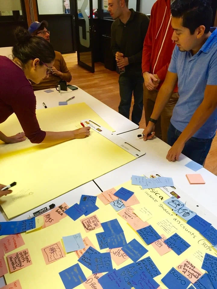
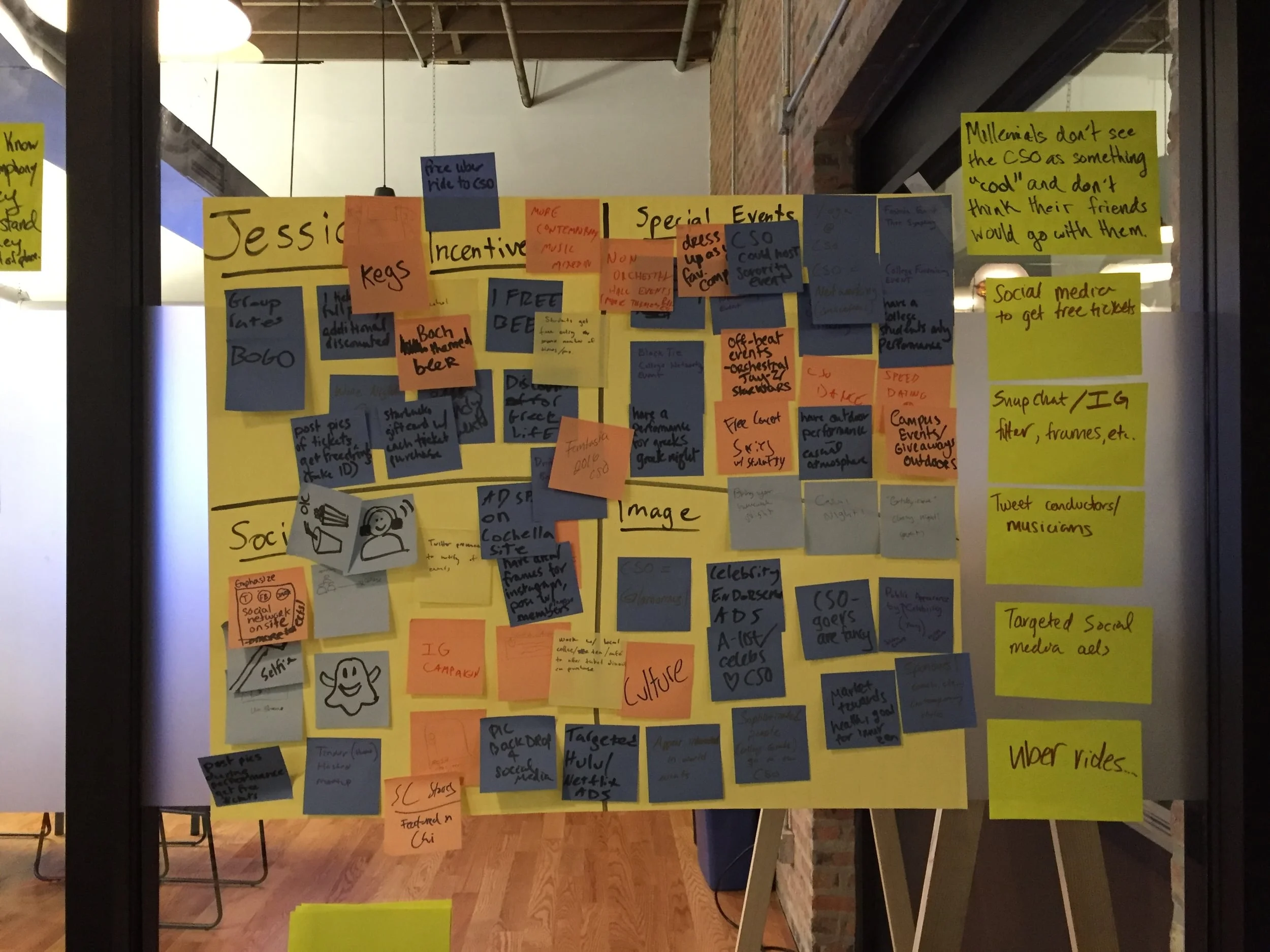
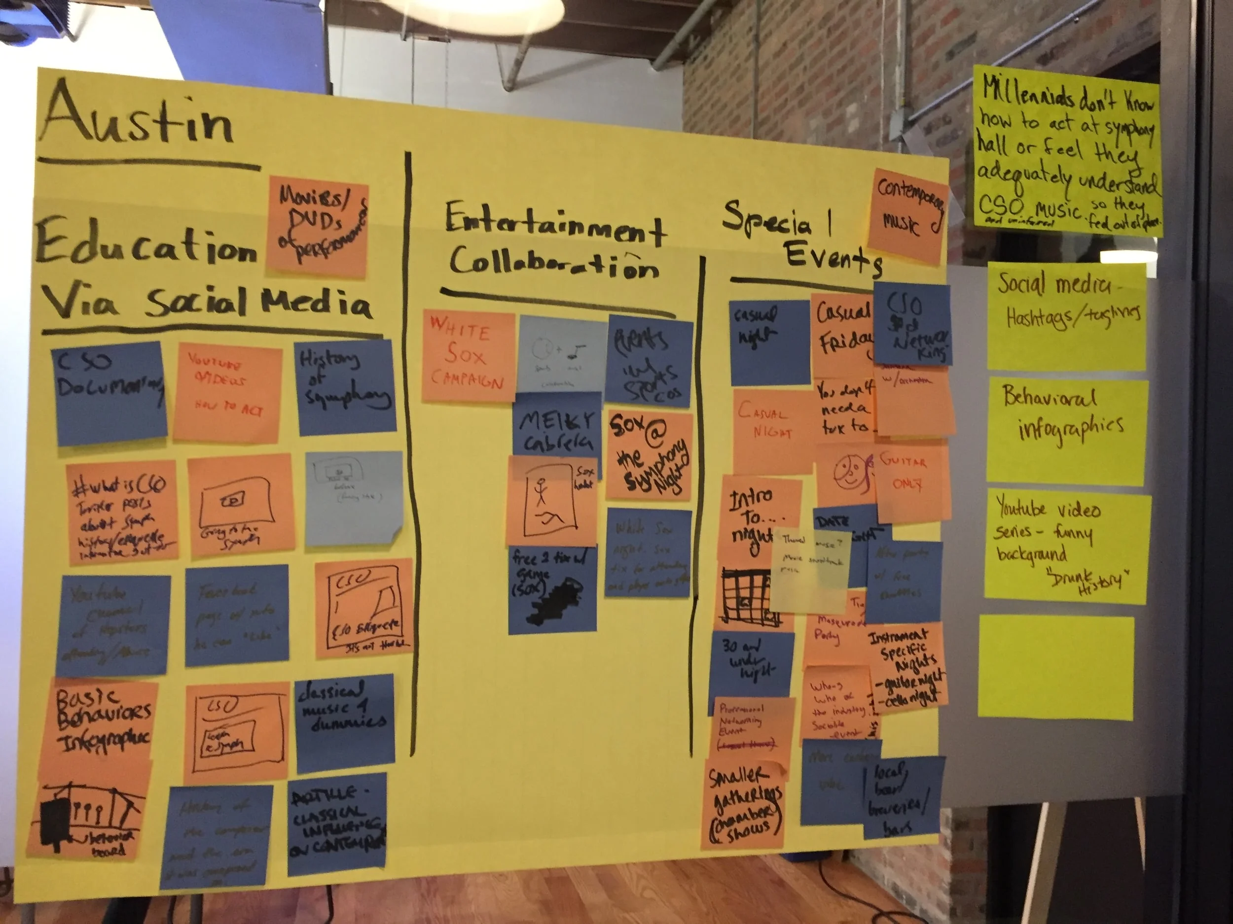
With the sizable accumulation of rich data we obtained, it was vital we find themed groupings and patterns within the data in order to distill essential insights. To accomplish this, we used affinity diagrams and assigned one data point per Post-It.
As always, Post-Its, collaboration, and coffee were essential tools in the synthesis phase.
KEY INSIGHTS
Through further synthesis, we discovered the key insights into why Millennials feel a lack of draw toward the CSO. These feelings were attributed to four main problems:
- Millennials don't see the CSO as "cool" and don't think their friends would go
- They don't feel the same excitement about CSO performances as other live entertainment
- They don't feel like they can fit in at the CSO
- They aren't sure they'd know how to act at the symphony, or be able to understand the music
PERSONAS
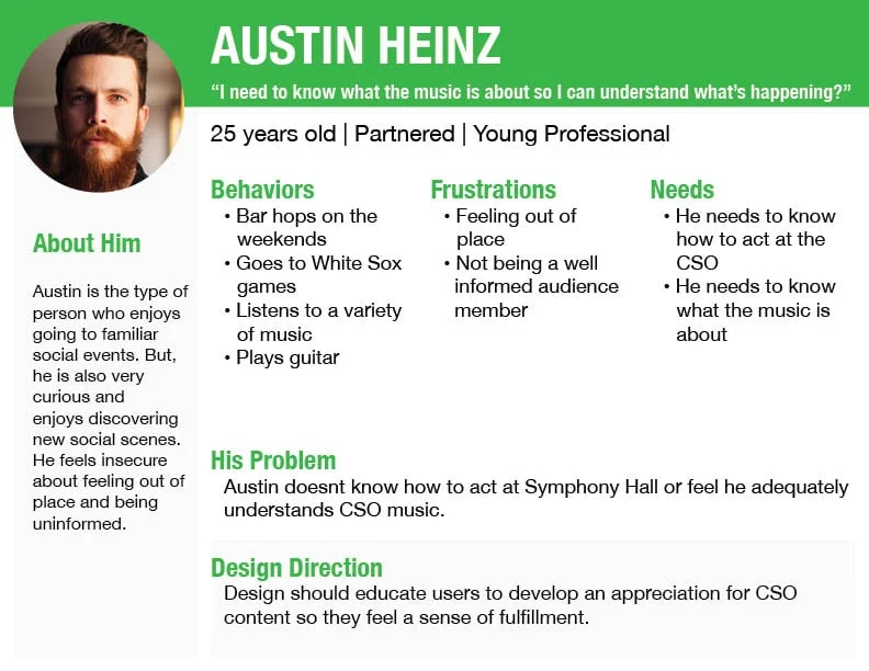
With our essential problem statements distilled, we needed to amalgamate the vast data and insights and transfer them into human stories.
(click to see all 4 personas)
The creation of the four personas helped center our designs through a human, research-backed lens, as well as lead us toward synthesizing our design direction:
DEVELOPMENT
DESIGN STUDIO
With our design directions in place, it was time to start the ideation process.
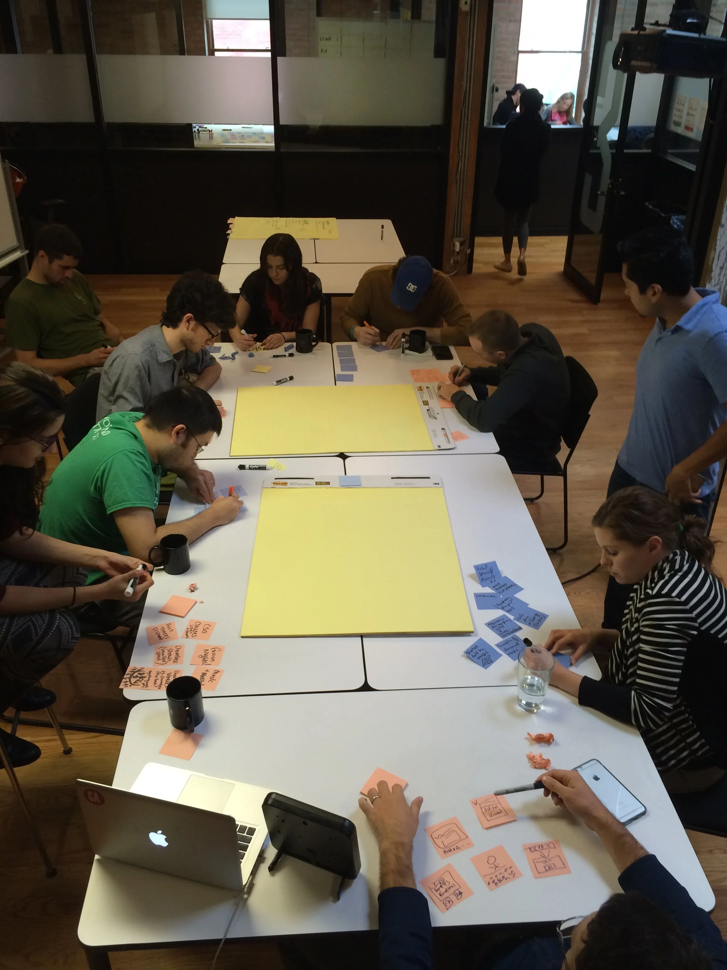
We decided to conduct a design studio, enlisting the help of nine gracious participants. The rapid ideation sessions proved to be quite useful toward producing a large array of creative, wide-reaching approaches to alleviate each persona's unique pain points.
(click to browse)
After analyzing the large assemblage of ideas, we realized nearly all of them were related to enticing Millennials.
After further consolidation and synthesis, we formed two enticement-driven solutions:
USER JOURNEY
With our design goals ready, we decided to sketch out a user journey to help us crystallize the vision of the project, further understand user behaviors, and identify key tasks.
DELIVERY
With social media our main tool and the website our main platform, we set out to accomplish the goal of enticing Millennials.
We focused on three elements, which were incidentally the same three elements that pushed Millennials away from the existing CSO website:
IMAGERY
TONE
CONTENT
SKETCHING & WIREFRAMING
With our approaches and methods in place, we started the production process, starting by making rough sketches and wireframes to visualize how our ideas could look and function.
(click to browse)
REACHING MILLENNIALS: TARGETED MARKETING
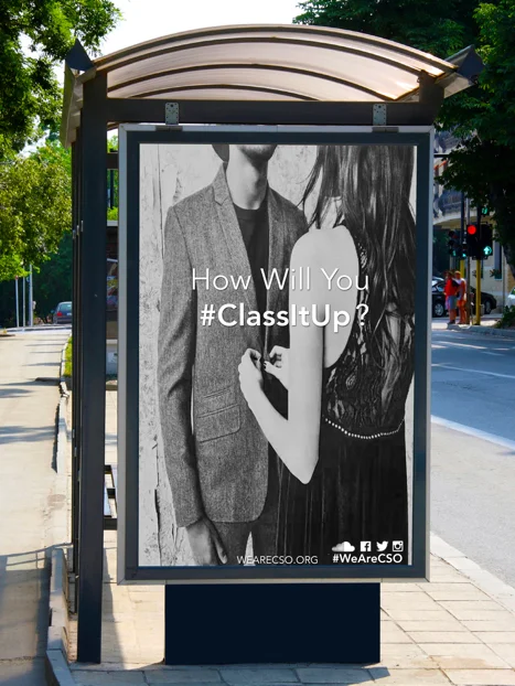
To successfully break through and entice Millennials, we decided targeted marketing needed to be sent and received on Millennial terms and on familiar Millennial social platforms.
The gateway for Millennials to enter the We.Are.CSO.org site would be (in this example) through use of hashtag on Instagram on a bus stop advertisement, using youthfully classy imagery.
FINAL DESIGNS
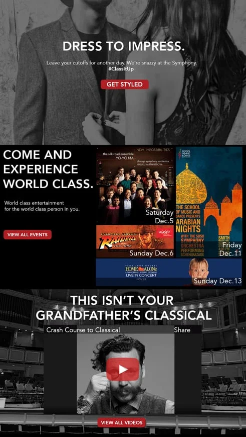
For our final designs, we raised the fidelity of the sketches and wireframes using Adobe Illustrator. The key elements of imagery, tone, and content continued to be the polestar of our designs.
IMAGERY:
Inclusive & Personable
One of the major negative perceptions of the CSO was that Millennials felt they couldn't integrate their culture into the CSO experience.
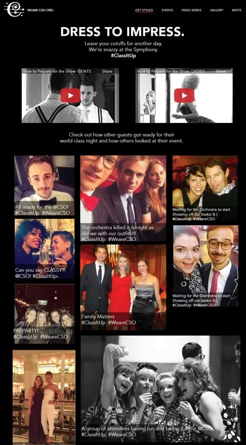
To reverse this perception, WeAre.CSO.org shows its commitment to inclusivity through its imagery and social media connectivity.
A "Dress to Impress" page supports Millennials to be classy and have fun in their own unique way by giving them the tools and opportunity to post their entire CSO experiences--from pre-game, to performance, to after-party-- connecting social media to the CSO through use of #hashtags.
TONE:
Cool & Classy
To tackle the perception of CSO's "uncoolness", the sister site conveys its new brand of cool & classiness through:
- fresh typeface that's concise and chic
- layout that supports smooth and easy navigation
- colors that channel authority, confidence, and sleekness
- copy that's witty, memorable, and can resonate with Millennials
CONTENT:
Informative & Fun
Through research we learned Millennials derive more enjoyment when the entertainment they experience is understandable or familiar. This poses a challenge when it comes to classical music and Millennials.
Fortunately, the vlog series, the "Dapper Life" featuring the lovable host, Dapper Dan, enables Millennials to enjoy learning about classical music and symphony culture in an accessible and enjoyable way.
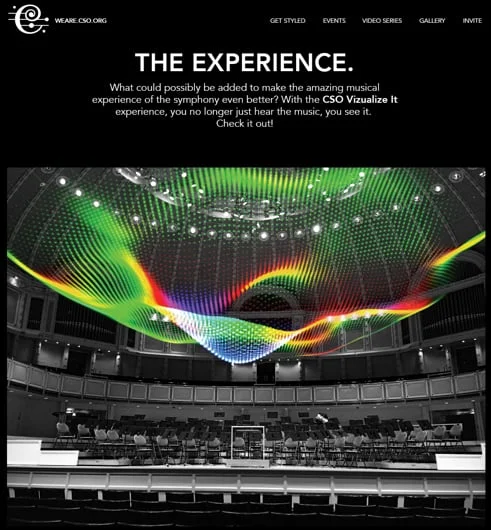
Additionally, as actual concert-going may be a pain-point for Millennials unacquainted with symphony concerts, the CSO now features a music visualizer, providing an additional level of exciting viewer engagement and visual support.
Through seeing the visual peaks in dynamics and rhythm, more concert-goers can enjoy the symphony like never before.
USER TESTING
Usability testing was a critical part of finding out whether our evolving designs were resonating with users and solving their needs. We validated the functionality of our design by having users complete tasks using the prototype.
Equally as important was determining if our designs struck the right tone and invoked the right emotions in users with regard to enticement. This kind of information was challenging at times to glean from users. Overall, we were pleased to see our design decisions were validated and that testers gave overwhelmingly positive feedback.
COMPLETE PROTOTYPE
The final clickable prototype is available to experience on InVision. Check it out here.


